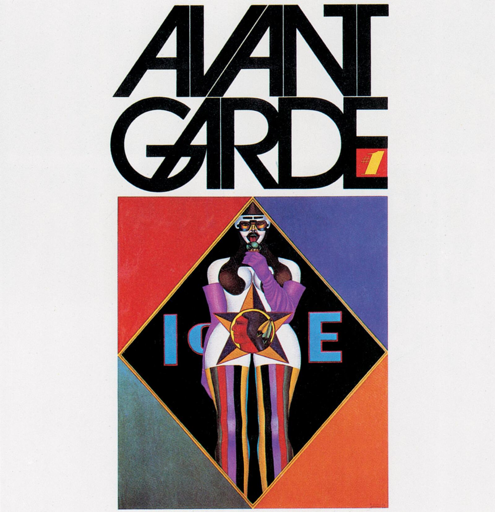
ITC Avant Garde Gothic
I chose the ITC Avant Garde Gothic font for analysis. According to MyFonts, this font was originally the logo for Avant Garde magazine, and its Roman typeface design was completed by Herb Lubalin and Tom Carnase in 1970. MyFonts also points out that it is one of ITC's earliest font series. Monotype describes ITC Avant Garde as having glyphs primarily composed of circles and straight lines. This is the font's most distinctive feature. When I observed it, I found its geometric structure to be very rigorous, giving the design a clean and modern look. It is precisely because of this structure that this font possesses a very distinctive personality. It doesn't get lost in the background but immediately creates a strong visual impact.
Another important feature of ITC Avant Garde Gothic is its suitability as a headline font. Monotype points out that its wide glyphs and high x-height make it very suitable for short texts and headlines. MyFonts also points out that current digital fonts, based on headline design, are best suited for font sizes of 14 points and above. A closer look at the glyphs reveals this to be quite reasonable. The glyphs are visually striking, making them easier to appreciate in sufficient space. However, some of their more distinctive details can become weaknesses in longer texts. The MyFonts website specifically points out that the single-layer lowercase 'a', the short loop of the letter 'f', and the short lower extension of the letter 'g' all reduce legibility at certain sizes. In my opinion, this doesn't mean the font is unsuccessful. It simply indicates that its main strength lies in visual impact, rather than clear legibility.
The third characteristic of this font is its alternative glyphs and ligature system. The MyFonts website explains that the initial demo design included 33 alternative characters and symbols, while the Avant Garde font archive highlights the font's rich ligatures. Alternative characters and ligatures create unusual combinations and a more stylized look, making the font appear elegant, sometimes even futuristic. However, this characteristic can also be risky. If the designer uses too many decorative combinations, the final result may be difficult to read. Overall, I think ITC Avant Garde Gothic is a successful typeface because it strikes a balance between rigorous geometry and strong visual appeal. It's not a neutral typeface, which is precisely what makes it memorable.